Archive for ‘graphic design’

April 22, 2010

Sustainable Graphic Design

by Creative Bleed

With today being Earth Day, I thought it would be appropriate to discuss sustainable graphic design. Sustainable graphic design is more than just recycled paper and soy based inks. It is considering a project’s entire life cycle and the resources used from beginning to end. Designers are constantly thinking “outside the box” creating fresh and innovative designs. Now we need to start thinking about the box using our creativity to promote greener design solutions and smart business decisions.

Renourish is a website that reaches out to designers by providing an online resource to help designers make more sustainable choices on their projects.  Led by Eric Benson, Yvette Perullo and Jess Sand, Renourish’s objective is to push the graphic design industry towards making sustainable design decisions part of every design projects and not just the “green” projects. Renourish provides tools such as a project calculator and paper finder. It also features projects and studios that have met Renourish standards for sustainability, as well as provide information and roadmaps that promote greener graphic design. If there is one thing you do today, I highly recommend taking a few minutes to check out this site, re-nourish.com

Green Graphic Design by Brian Dougherty of Celery Design Collaborative is another excellent resource for designers who want to learn how to incorporate sustainability in everyday design projects. Dougherty uses the avocado as a metaphor to describe the designer’s role in graphic design: designer as the manipulator of stuff, designer as the message maker and designer as an agent of change. Using these three factors, he applies them towards sustainability and the “range of possibilities as a green designer is directly related to how you define your role as a designer.” We are all familiar with thinking about the materials being used but what about the message being delivered and how that message influences our audience.

Changing the way we design means changing the way we brainstorm. Dougherty encourages a brainstorm process of NGISED, “designing backwards.”  Although we typically do not like to think that what we have worked so hard on ends up in the trash, it is the reality we must face. Designing backwards may sound discouraging but potentially it will put more value in our work. Considering the destiny of our designs will dictate the most effective way to deliver the message and the materials used to make it (and deliver it) this will allow us to somewhat foresee and plan our end project’s destiny. In other words if your project’s inevitable destiny is the landfill, you’ll know to stay clear of materials such as certain plastics and finishes that could contaminate our landscape further. Green Graphic Design is an easy read and I highly recommend it to designers. Green design is good design. Happy Earth Day everyone! k

Dougherty, Brian. Green Graphic Design. New York: Allworth Press, 2008. Print.

February 18, 2010

Conceptualizing Gold: A Look At Olympic Poster Design Concepts

by Creative Bleed

Daniel Yund Concept for Olympics Poster Series, 2008

In spirit of the Winter Games, it would only be fitting to have a post on Olympic poster designs. Designing an Olympic poster is a classic student assignment for Graphic Designers. Searching the web, I came across these two up and coming designers, Daniel Yund and Alan Clark. Both designers use concrete shapes, repetition and the movement of the sport which contrast from the Olympic Games posters that we have seen in recent years. Typically Olympic posters are more complex, focusing on the athlete, form, motion and emotion. Although these designs are concepts and not official Olympic posters, their work is clever, unique and very Swiss . K

Alan Clarke Olympic posters proposal for London 2012

“My thinking behind these posters was to convey the movement and energy of the games, in a simple yet abstract way. The designs focused on the movement and speed of the athletes equipment. They were used to help travelers associate relevant tube stops, with the Olympic events that are being held there.”
– Alan Clarke

Alan Clarke Olympic posters proposal for London 2012

Otl Aicher 1972 Munich Olympic Posters are a great example of the International Style and most likely inspired the designs of Clarke and Yund. What are some of your favorite Olympic Poster Designs?

Official Olympic Games Poster Munich 1972

What do you think of the 2010 Vancouver posters?

Official Olympic Games Poster Vancouver 2010 Snowboard Halfpipe

Official Olympic Games Poster Vancouver 2010 Figure Skating

February 2, 2010

Screen Prints and Polar Bears: LOST Fans get Creative

by Creative Bleed

Designed by Ty Mattson of Mattson Creative

What does an island, a polar bear, a VW bus, a paintbrush and a screen print all have in common?

The LOST fanatic. The final season of LOST premiers tonight! As a huge fan of the show, it would only be appropriate to feature some work by fellow LOST enthusiasts, who have found the show to be their creative muse. Has LOST inspired you? Check it out. K

UPDATE: TY Mattson LOST Art is now available at the abc store at abc.com, click here.


Olly Moss "Locke's Secret"

Methane Studios "The Dharma Van"

Julian Callos "No Man Is An Island" ink, acrylic and gouache on watercolor paper

Check out more LOST inspired art at:

damoncarltonandapolarbear.com

The LOST Underground Art Show

December 14, 2009

Barcode Revolution

by Creative Bleed

Why hasn’t anyone done this sooner…redesign the barcode! It’s a classic example of assuming something has to remain untouched because changing it would create chaos. Leave it to a Japanese design firm, Design Barcode, Inc, to push the boundaries and explore creative freedom by changing the barcode and starting a revolution. Although they have been doing this for years, I have yet to see or notice one on packaging here in the States, but apparently, they are all over Japan.

December 7, 2009

Fontastic Finds

by Creative Bleed

Combining two beautiful things type with desserts!  Sweet Treats: A Typographical Cookbook by Woodward Design of Alberta, Canada is not only a great self-promo piece but a must for type junkies.

Word Up, we could all use a little more bling and a lot more swash, new t-shirt by Veer.

Inspired by a Paris flea market find this Alpha Table from Crate & Barrel is made of sustainable shesham wood.

Alpha Decor by Urban Outfitters

A little vague but still a fun idea serif tote by Little Factory.

November 24, 2009

Less is Green

by Creative Bleed

Simply well designed, this colorless Coke can is a great example of designers rethinking how we use materials and the impact on the environment. k

By Designer Harc Lee, Concept for Eco-Friendly Coke Can from the dieline.

“A convex logo substitutes colorfully sprayed can. Naked can help to reduce air and water pollution occurred in its coloring process. It also reduces energy and effort to separate toxic color paint from aluminum in recycling process. Huge amount of energy and paint required to manufacture colored cans will be saved. Instead of toxic paint, manufacturers process aluminum with a pressing machine that indicates brand identity on surface.”

May 27, 2009

Who took my pickle?

by Creative Bleed
From pickle to tomato

From pickle to tomato

While having breakfast one morning at Stacks, I noticed Heinz has replaced their iconic little pickle with a vine ripe tomato on their ketchup bottle.  According to Heinz, they have retired the pickle after 110 years from the ketchup bottle and replaced it with the tomatoes to emphasize their “Grown not Made™” campaign. Although the tomato is more appropriate then the pickle, illustrating a natural and fresh product, the little pickle will be missed. So where did the tiny pickle come from? According to Heinz, the pickle originally adorned itself as a pin and was handed out at the World’s Fair over 100 years ago as a marketing gimmick. The “pickle pin” grew in popularity, as did Heinz, eventually taking its place on Heinz packaging. Apparently, you can still get a “pickle pin” through Heinz directly by request. Although I have yet to receive mine.

May 21, 2009

Consommé, Skateboards, DIY Indie Art fest!

by Creative Bleed

5 places to check out in the next few weeks!

My Warhols

My Warhols

1) The Prints of Andy Warhol at the San Jose Art Museum ends Sunday, May 31st. It’s a small exhibit of his screen prints from the Andy Warhol Museum in Pittsburgh. The exhibit consists of prints of Norma Jean, the Campbell Soup cans (umm, beef consommé with gelatin, anyone?) and Volkswagen Beetle ad. There is even a little table set-up to create your own Warhol. Don’t waste your time on the text scavenger hunt, lame.

Upstairs is an exhibit called Women’s Work: Contemporary Women Printmakers that is showing until Sunday, August 16. This exhibit consist of work by female artist Barbara Kruger, Wangechi Mutu and a beautiful lithograph by Vija Celmins. A solid collection addresses issues of gender, race, identity, politics and nature.

Maker Fair Swap-O-Rama

Maker Fair Swap-O-Rama

2) Maker Fair at the San Mateo County Expo Center, May 30 & 31. This year’s theme “Remake America.” The Maker Fair is a DIY festival. Festivities include interactive DIY projects, Swap-O-Rama-Rama (bring old clothes, accessories to swap and remake!), Bazaar Bizarre (shop for handmade crafts and indie arts). Tickets are $25 for an all day pass.

3) Skate this Art at the Market Street Gallery, SF, ends Saturday May 30th. Skate this Art is a group show of over 50 local artists whom hand painted decks and donated them for an auction on May 8th to benefit the Roaddawgz Homeless Youth Center. Check out this article from SF Chronicle for background info.

4) Signs: Wordplay in Photography at the deYoung Museum until June 14. Features work by Walker Evans and Lee Friedlander. Should be a great exhibit for not only photographers, but also graphic designers and typography lovers!

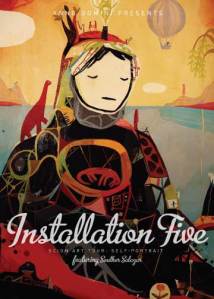
Artwork by Souther Salazar

Artwork by Souther Salazar

5) First Fridays in downtown San Jose, Friday June 5th at 8pm. Free. Check out the Scion Art Tour at Anno Domini Gallery.

Have FUN! Please feel free to email me if you had an opportunity to check any o these out or have any suggestions. K